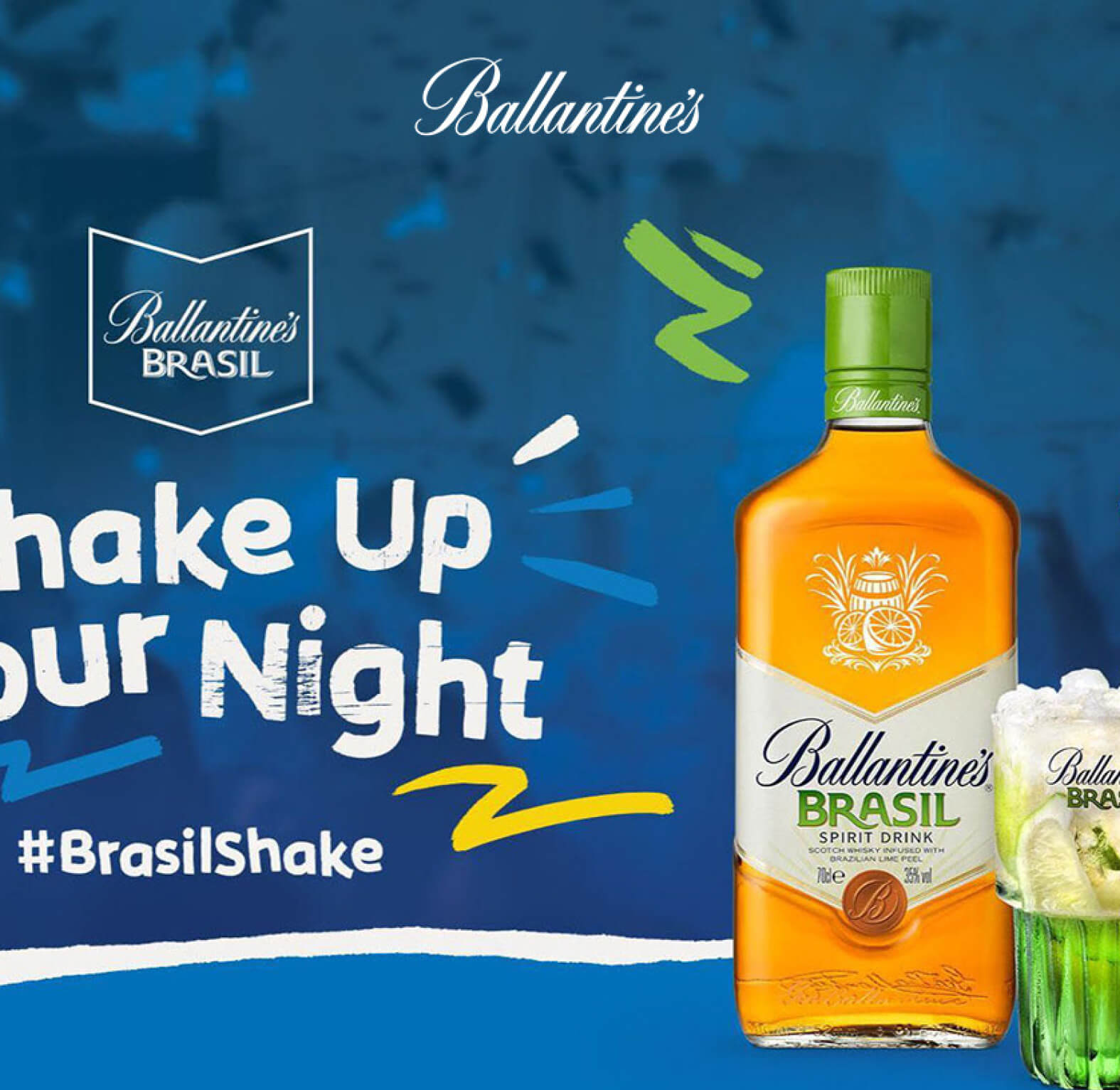
I updated the look and feel of Ballantines.com by modernising a WordPress template to be used by a global network of marketers in their home markets, including a product showcase and cocktail library
Updating a mundane and old-fashioned website, I included a product showcase and cocktail library on Ballantines.com to make it appeal to a trendier audience.
01.
Goals & Challenges
Given the limitations of the original WordPress site, I reviewed the sitemap of Ballantines and information architecture of the content. I wanted to make a template that would allow marketers the ability to create campaigns, whilst remaining consistent with the Ballantine's brand. Significant elements included the Ballantine's product range and a cocktail recipe library.
-
We aimed to:
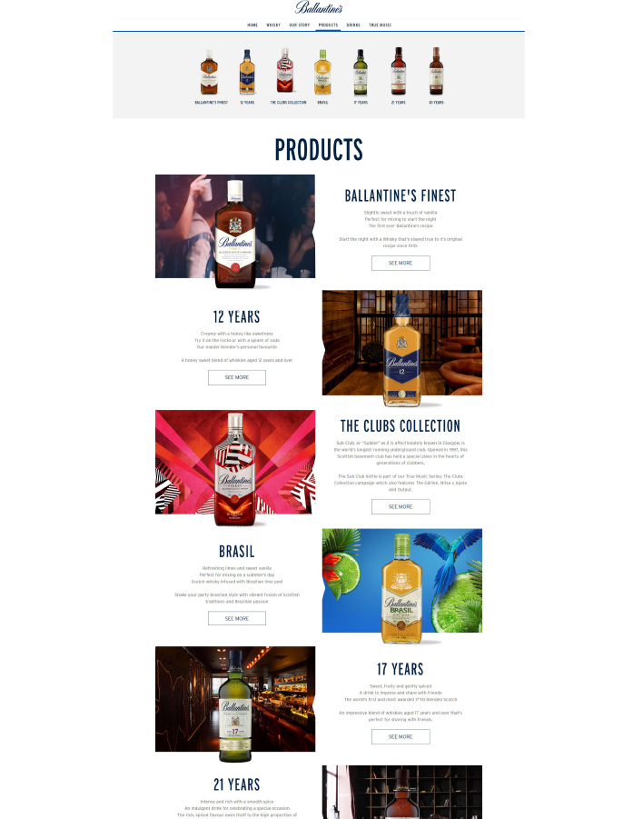
- Amplify the product range for maximum exposure
- Create engaging and live content (such as events and campaigns) for repeat visits
- Maintain systems with which the marketers were familiar, namely WP CMS
- Preserve the global Ballantines brand but allow flexibility for slight variations in marketer's preferences between global markets.
02.
Research
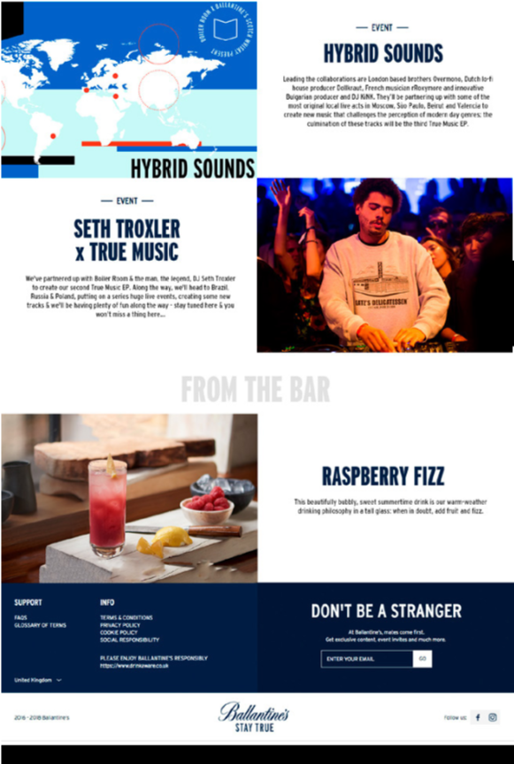
After performing a review of existing content and leading stakeholder interviews, we were able to map features and write user stories. Through prototype feedback and testing, we gathered requirements. We combined various campaigns, such as True Music, and branded it in line with Ballantines products.
User feedback informed us that the original WordPress template was restrictive and dull. We used an empathy map to find similarities between users whilst ensuring the new layout was immersive and user-friendly and promoted the product to the best possible effect.
Existing template
03.
Design Process
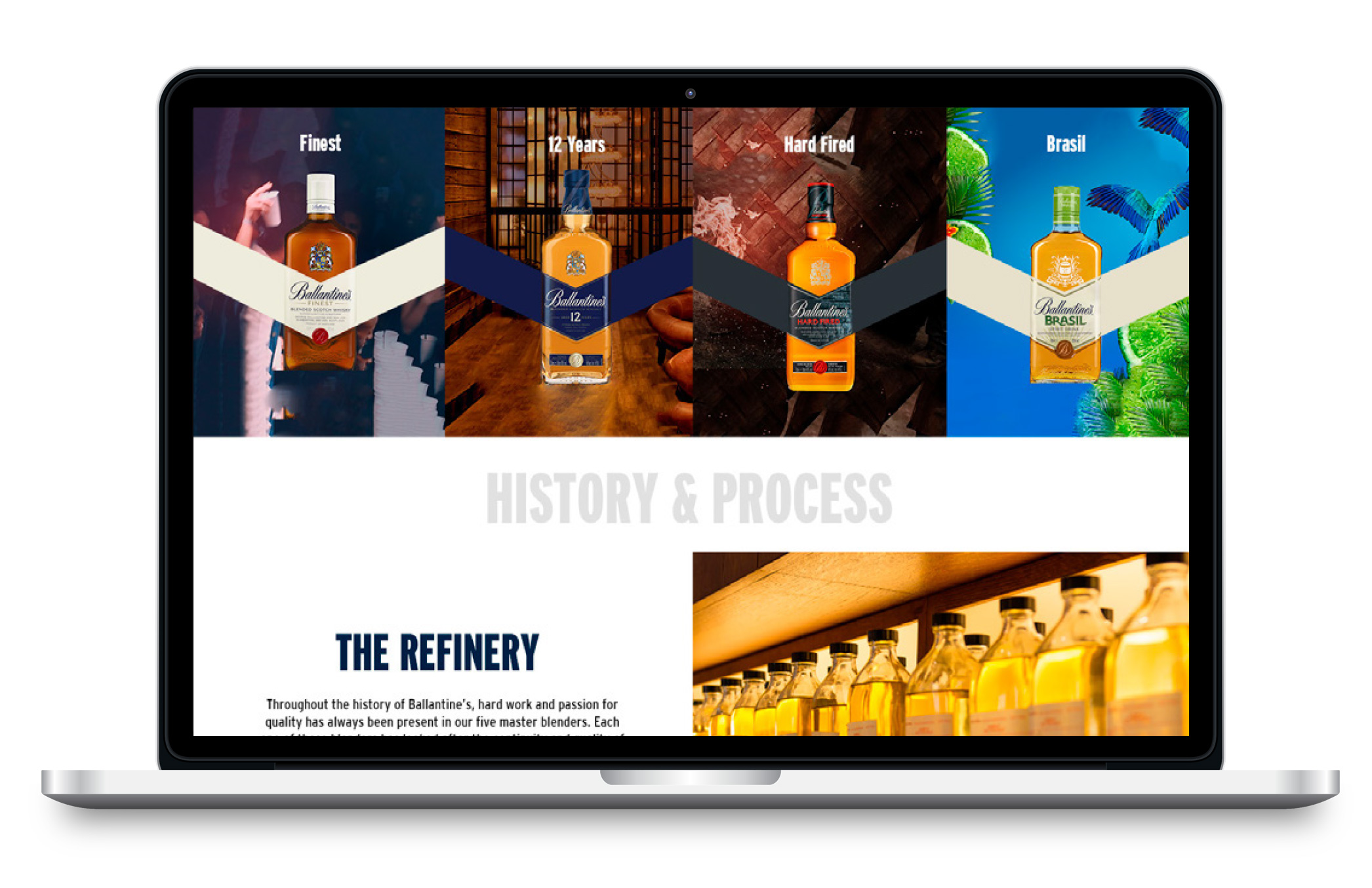
With the aim of updating the previous simplistic template, I decided to dedicate a full page to each product in the range. I used the brand's iconic 'chevron' throughout, with a different background for each product. Using parallax, I was able to achieve a sense of dynamism. This was an effective yet simple technique for engaging the user.
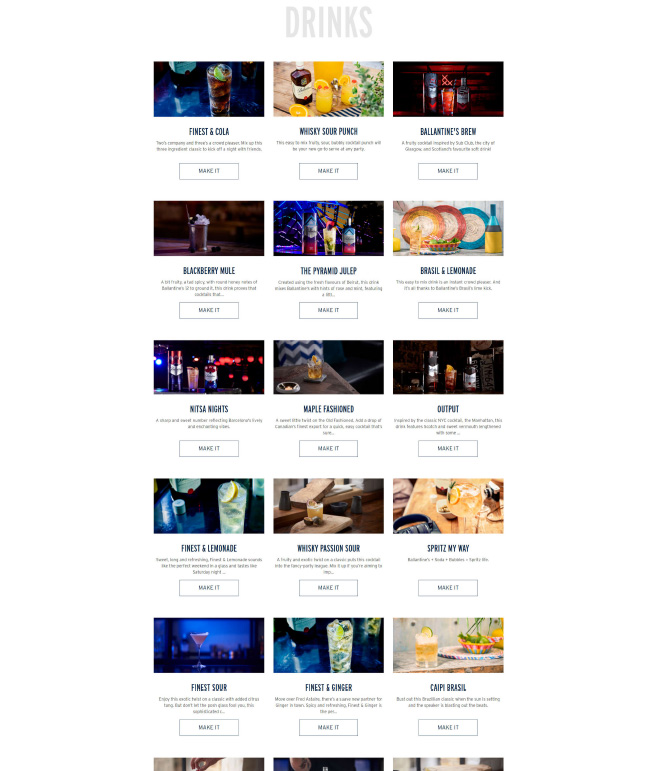
I then focused on the cocktail "bar". For consistency, I employed the same paralax technique. The user could flick through each cocktail recipe independently, giving the effect of being 'slid' a drink by a bar tender.
The navigation was simple and on brand. By clicking on logo, a slide down menu with a translucent floating bar appeared with the symbolic chevron.
Homepage section design
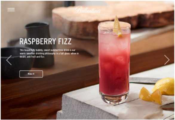
Cocktail recipes in "The Bar" section
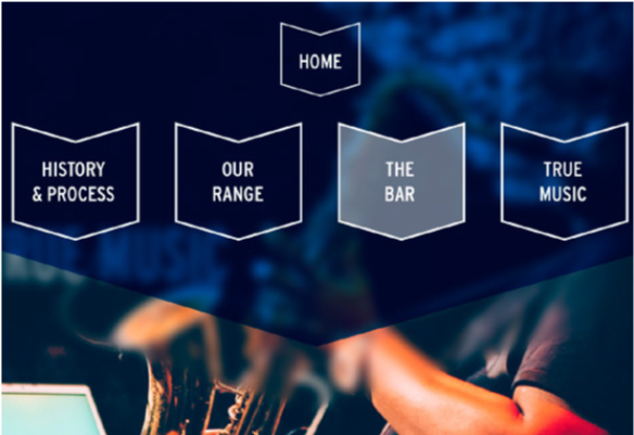
Site navigation