Creating a framework to exhibit Unispace's project collateral within a spatial setting, developing a CMS to enable content to be directly controlled by the designers & strategists
As an office design firm, Unispace wanted to enhance the context within which strategy and design content was communicated to the client. Being new to the company, I was required to quickly scope out the internal resources, skills and knowledge available to me. I was placed in charge of project managing and building new business connections between departments.
01.
Goals & Challenges
The project was to be done externally at a projected budget of £40,000. Bringing this in-house meant hiring skill sets that were not available at Unispace.
-
Our high-level goals were as follows:
- Ability for strategists and designers to load and alter content themselves
- Act as a repurposable framework for other projects
- Act as both an online and local digital exhibition tool for clients
- Create a navigable 3D experience, with detailed material being made available
- Create a deep and rich client experience that would act as a business development tool
- Stick to limited budget and time constraints
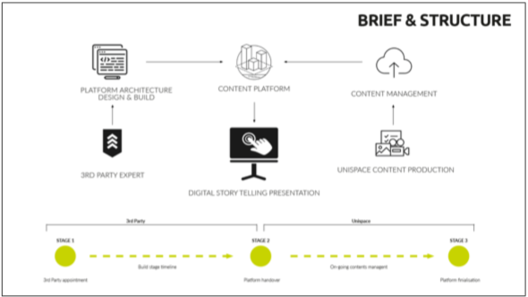
Brief
02.
Research
I started with a detailed brief of the requirements, team and quote. I immediately developed a quick prototype to test feasibility, bringing in 2 external designers with relevant skills sets. Subsequently interviewing the project sponsors helped to clarify the original brief and how the final project would be used. After market research, I was able to see what had been produced by competitors, what similar products we were competing with, and what 3rd party offerings were available. I was then able to identify the skill sets within my team, as well as utilise relationships with stakeholders to meet BIM and visualisation specialists, helping me to delegate work effectively.
By creating user flows, my team was able to map different user journeys and scenarios to better understand the user's journey. I presented this information to my team with illustrated storyboards to ensure a cohesive vision throughout.
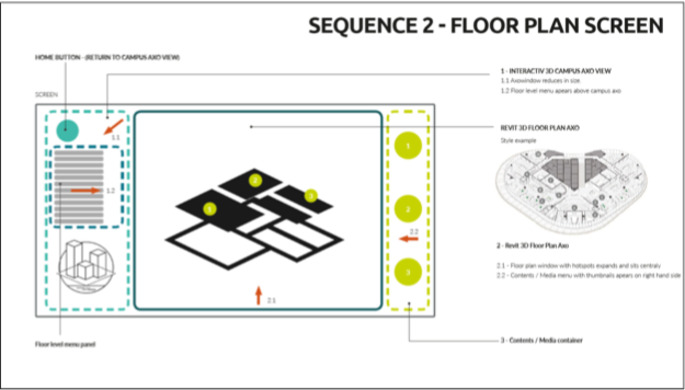
Initial concept
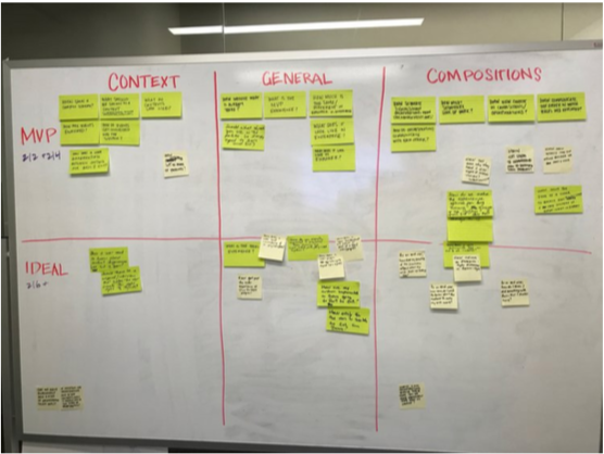
Function mapping
03.
Design Process
Following research, we created a list of important features the app should have. I then found a professional skilled in BIM and 3D visualisation. I took the initiative to build a remote outsourced team to complement the in-house staff and fill gaps in skills and resources. I helped the team collaborate remotely together and performed daily scrums to understand the progress of the build.
With both paper and higher-fidelity mockups, I conducted user testing with a total of four participants, three from Unispace and one from the client.
-
The goals were three-fold:
- Unispace testing of the CMS to find out whether users could change content using the CMS
- Testing the user flow in-situ and tailoring the information according to the user
- Helping the client understand the design and strategy.
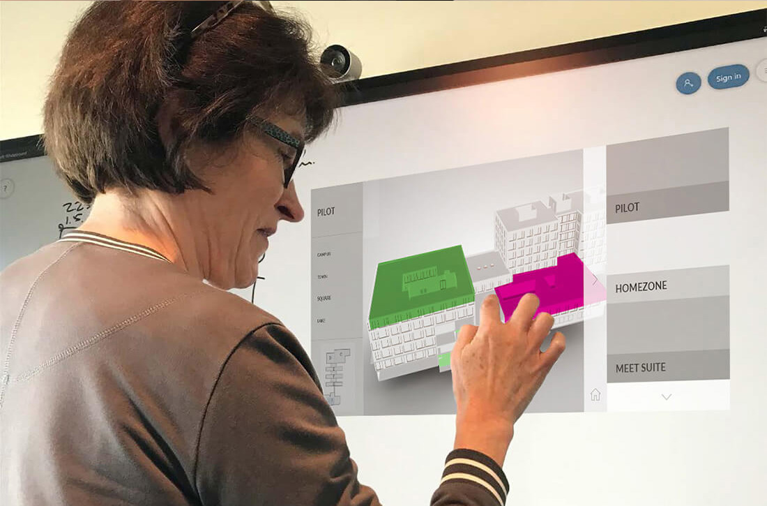
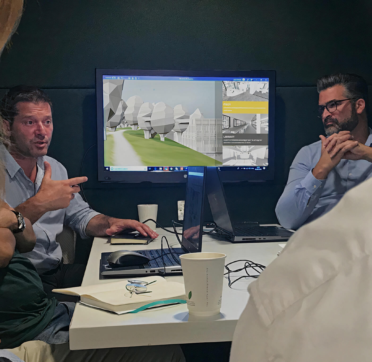
Prototype user testing
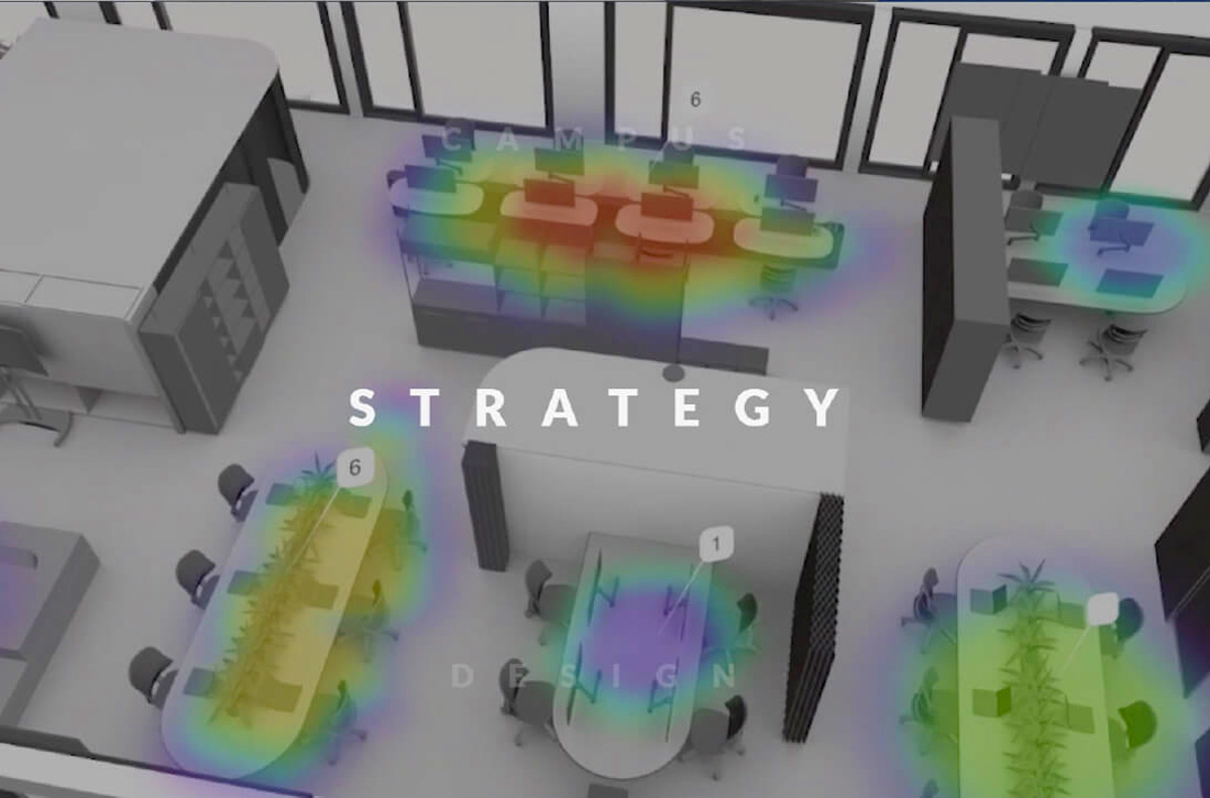
Video carousel welcome screen
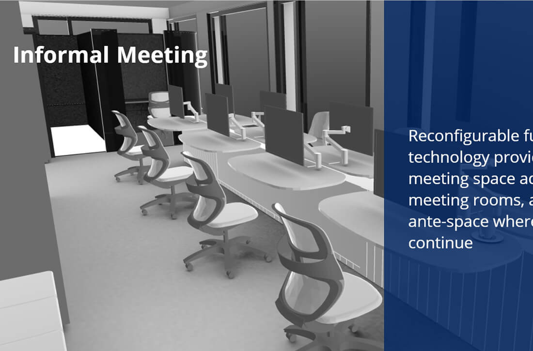
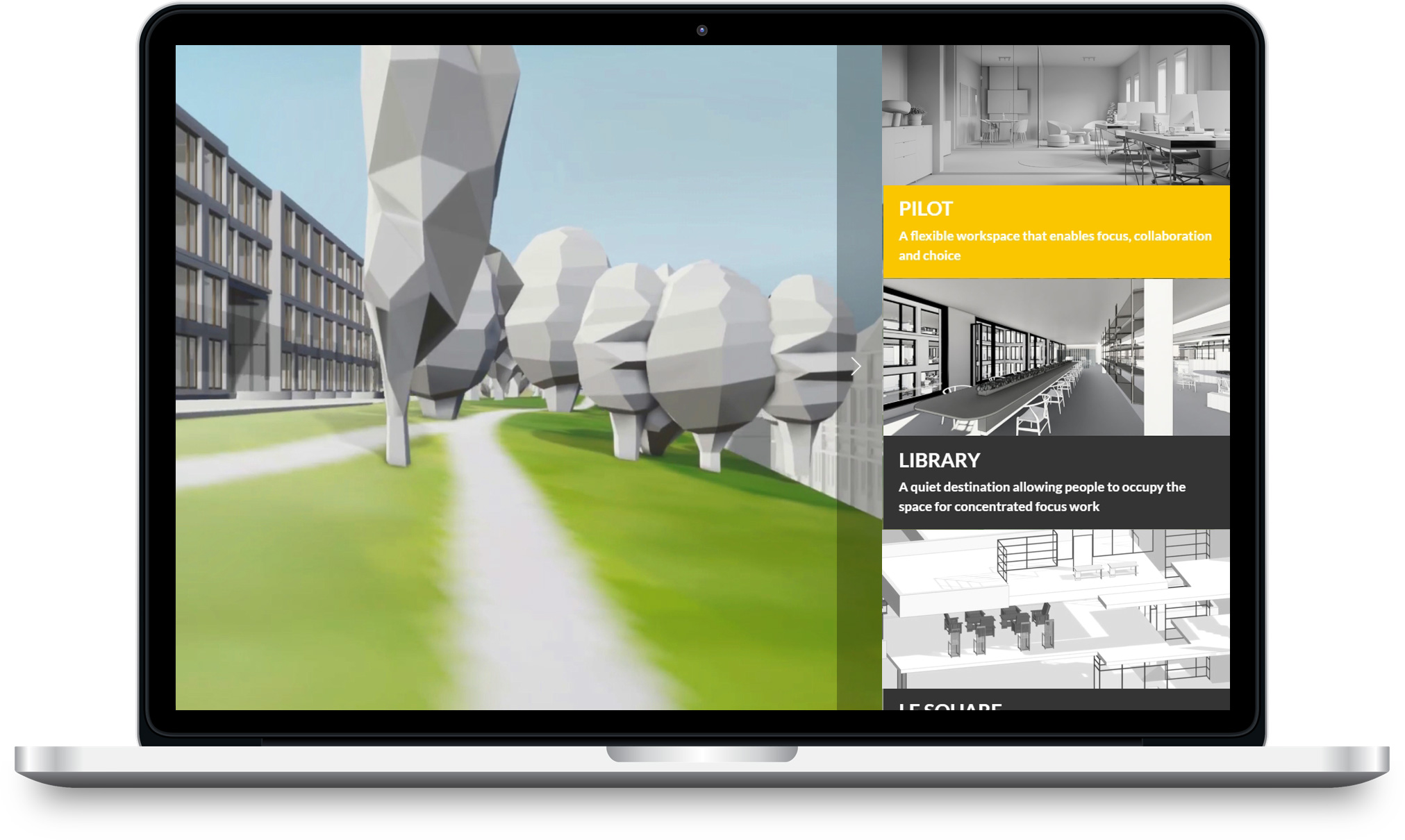
Individual internal scenes with narrative overlay
We decided to use a light framework to improve the overlaying of information on top of the 3D model. After consultations with the web developer, we chose to use Code Ignitor php. Designers and strategists PDF content was incorporated using Modelo 360s, which allowed the user to enter the space and view it internally.
Separating the 3D model into external and internal sections, the user could explore the entire campus, with a corresponding narrative and complementing information panels. Furniture and facilities could also be isolated and scrolled through.
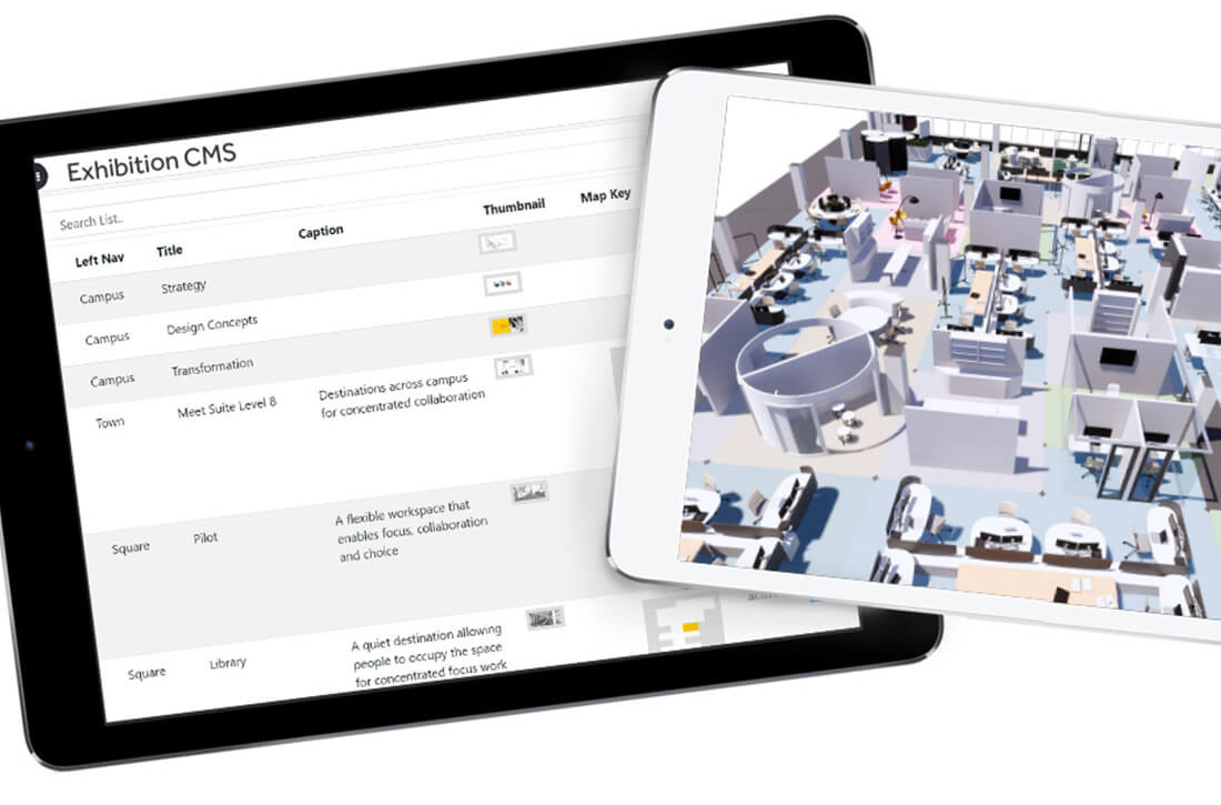
The CMS allowed designers & strategists to control content directly
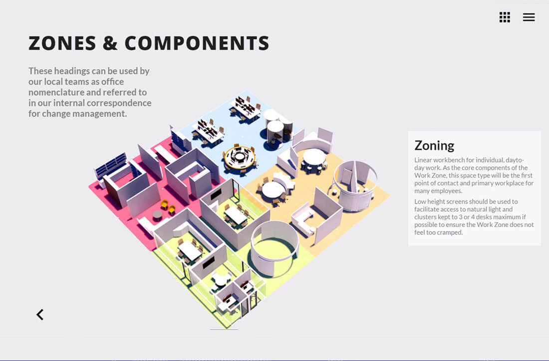
An interactive web3D zoning app created an immersive experience
04.
Results
The final product was a success with both Unispace and the client. Indeed, the client requested to have the product available on a local machine in their new office.
