Modernising an antiquated business practice by creating a searchable project library for directors to have details of any project at their disposal during business development meetings with clients
Arup Building team directors wanted to develop better procedures for business development meetings with prospective clients in which project case studies were discussed. Previously, the director had to decide prior to the meeting which projects the client might like to see. This was laborious and inefficient. My object was to set up a much more streamlined app system for searching projects.
01.
Goals & Challenges
The goal was to design a project library for iPad that allows directors to select projects easily with readily accessible information and collateral, including images, videos and models. This enhanced the efficiency and productivity of such meetings. The app's goals were as follows;
- The ability to transfer individual PDF file project sheets to a digital library
- To allow clear and simple navigation and selection of projects
- To be accessible on Apple iPad, as these had recently been purchased by the company
- To hold Arup company information for use in discussions
- To present project detail and rich media, such as images, video and models
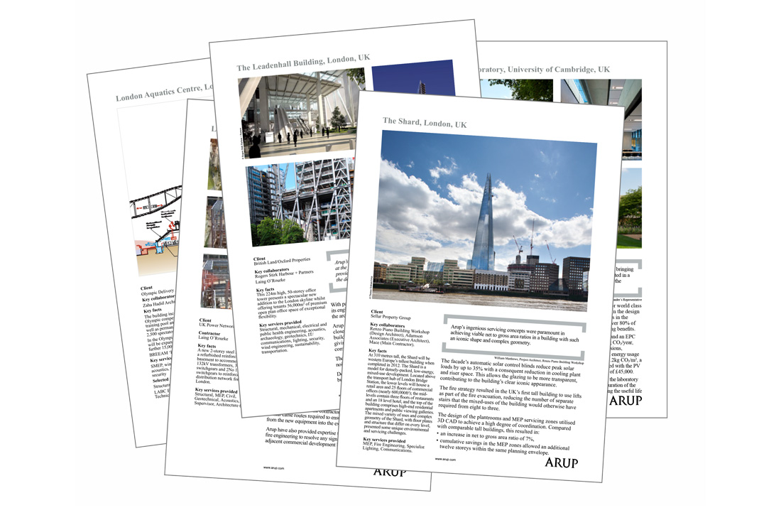
Original paper case studies
02.
Research
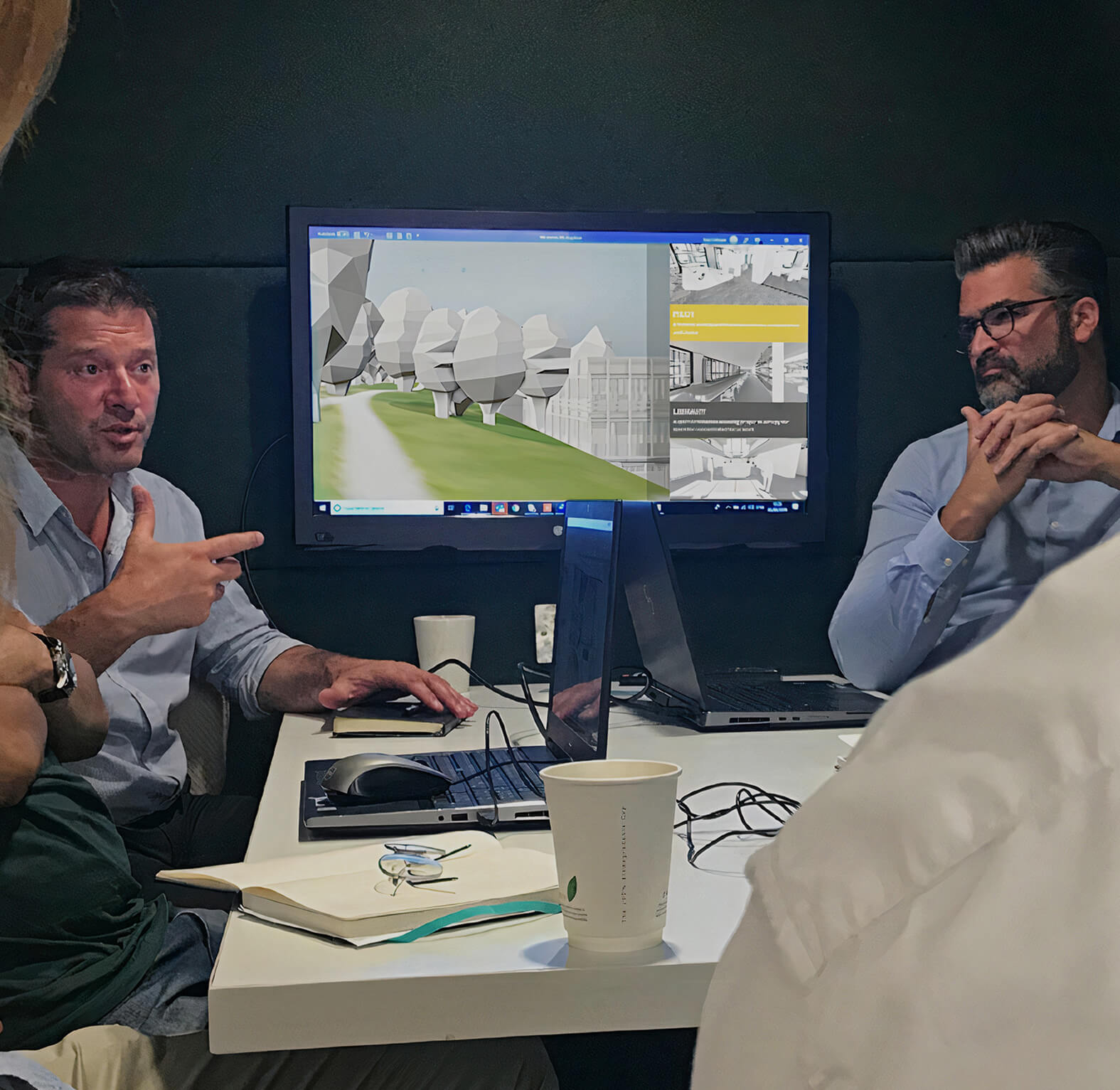
I conducted interviews with three directors. We discussed the inadequacies of the antiquated system of printed project case studies and sought a richer way of sharing projects with the client.
'It would be great to be able to pick projects as the
conversation went on'
Michael Stych, Arup Directors
Creating personas demonstrated the key user goals and frustrations that appeared in my findings; creating an empathy map helped discern commonalities between the director's view points.
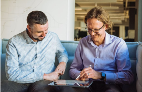
Prototype user testing
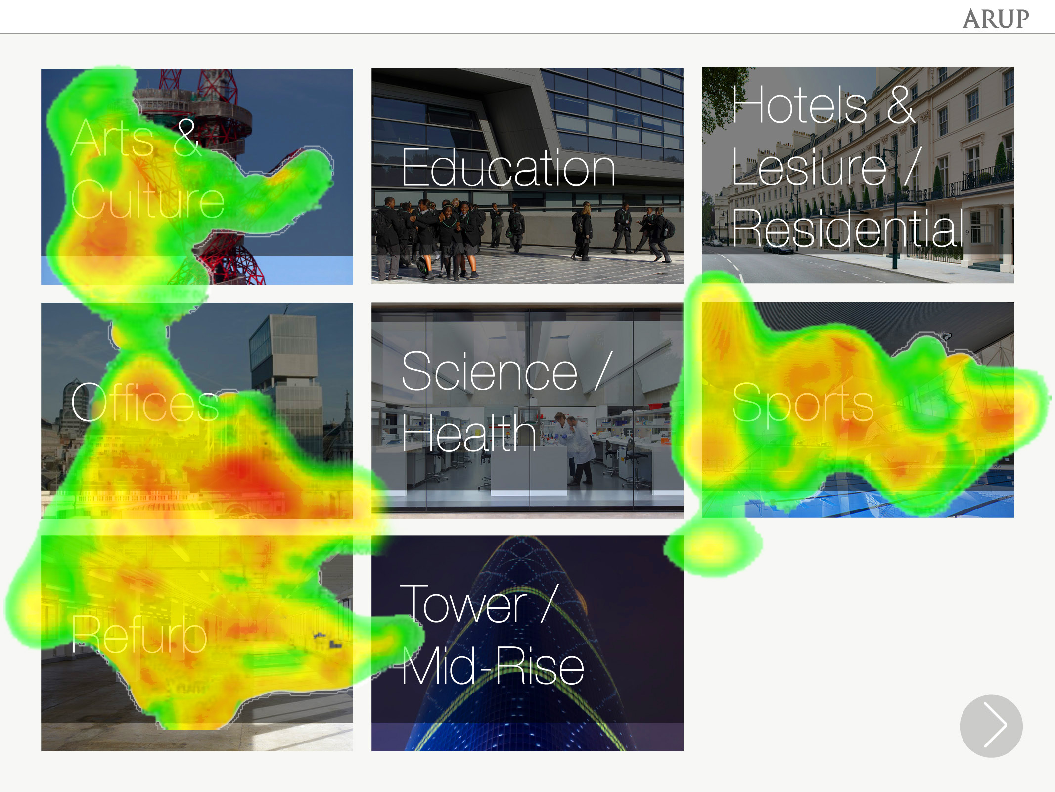
Heat map and session tracking
03.
Design Process
Following this research, we collated a list of features to be included in the app. A feature roadmap then allowed us to meet the higher-level goals. Subsequent user-testing showed us how the app would be navigated by different users. Lists of projects could then be divided alphabetically and by building type and architect.
We then utilised Adobe DPS (Digital Publishing Suite) to produce interactive content for the iPad without the need of a professional coder. The prototype I created included interactive functions such as scroll. Collecting pain points allowed us to portray different scenarios and consider the problems according to different perspectives.
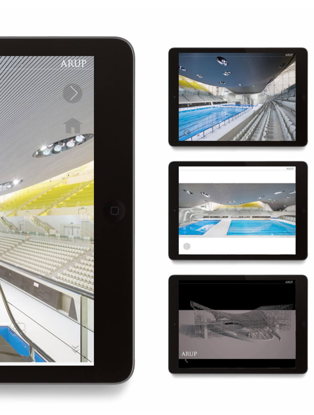
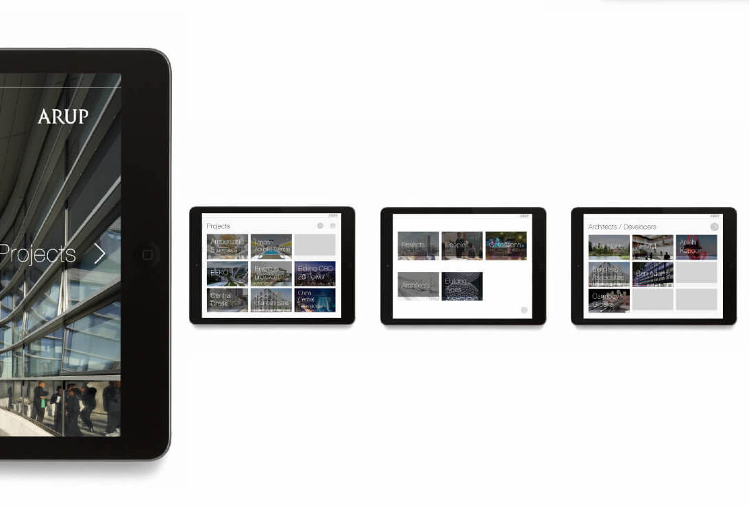
Projects scrollable lists
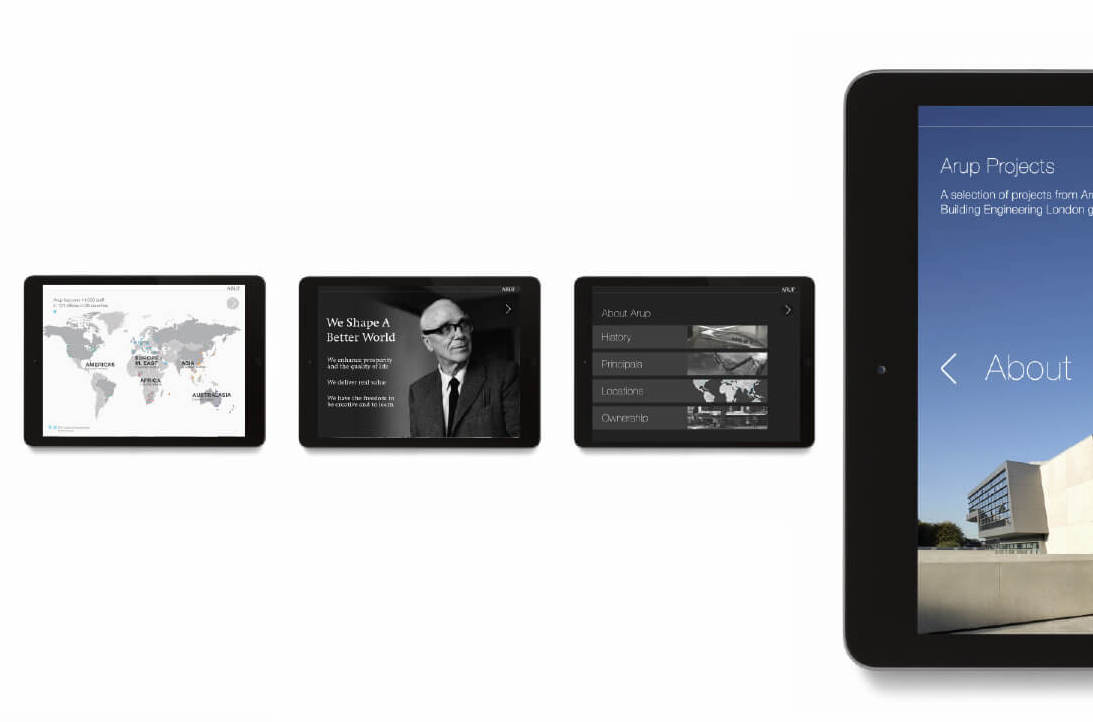
Company information
The native behaviour of DPS allowed us to create a flip-book system whereby users could quickly change projects and extend and condense information with a single click, allowing the tool to enhance meetings in a non-distracting manner.
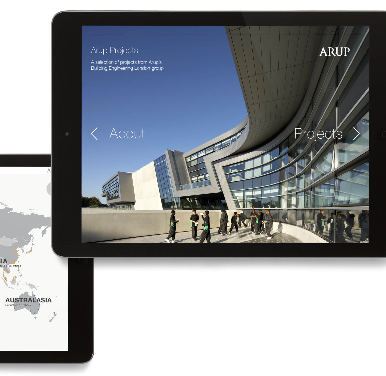
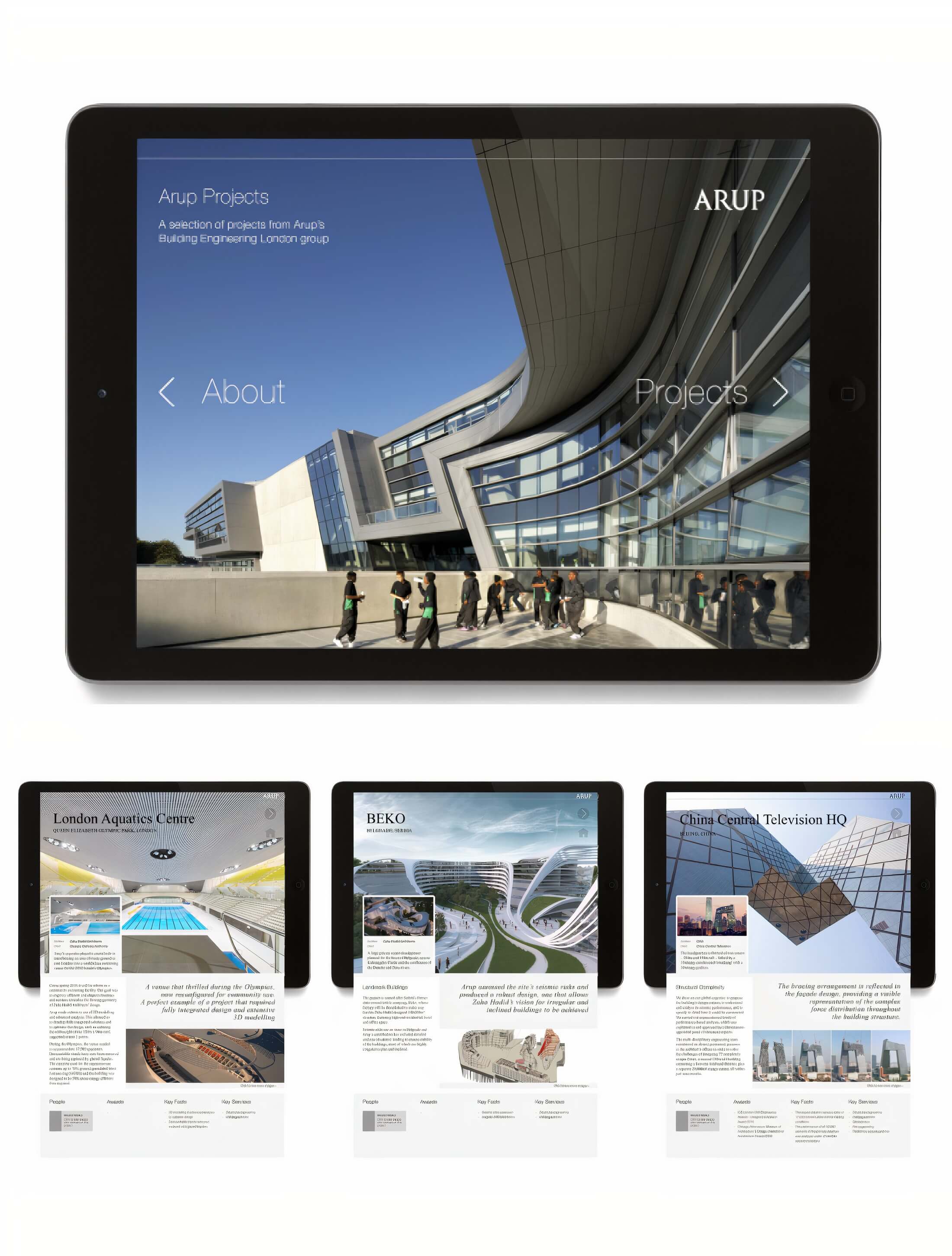
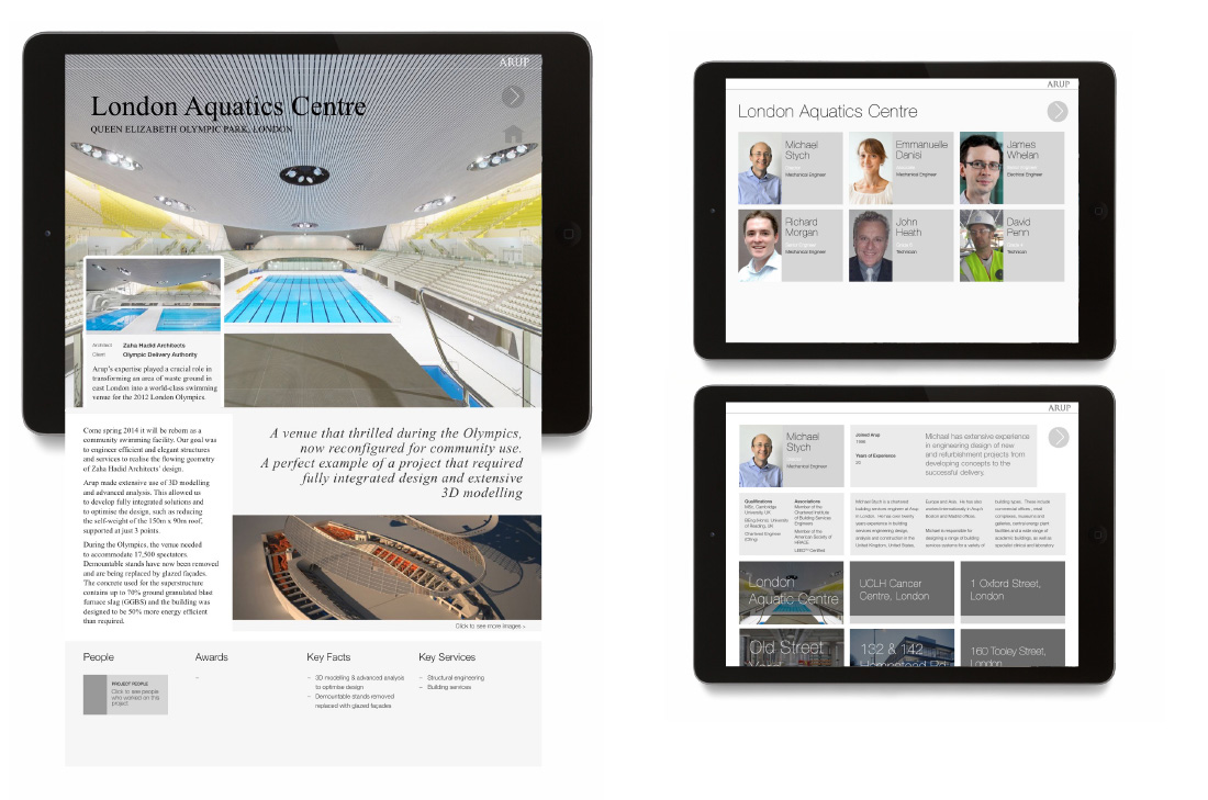
The homepage introduced two-fold options, designated by left and right arrows. Swiping left would take the user to a page entitled About Arup, whilst a simple right movement displayed Arup's Projects. The About Arup page gave information on Arup's history, values, financial reports and office locations. The Project section used a scrollable list in which projects were categorised by architect or building type. A full screen image would then appear alongside information such as the project title, budget and architect/client information. Scrolling down expanded the detail, including quotes, awards, services and team members.
The user was able to navigate between projects with a simple horizontal scroll (the flip-book feature). Any additional photography, videos and 3D models could be accessed through the project page, keeping all collateral easily accessible in one place. A list of the Team Members who worked on each project was also made available, and was extended to allow each Team Member's CV to be seen, creating a circular link of people and project work.
04.
Results
The app was a success. It received great feedback from its first users - the directors - who then made it available on Arup's internal app store for general download by any member of Arup's staff - 70% downloaded the app and gave positive feedback about their client's response to the 3-D models.
