Providing customer service agents with intuitive software to improve workflow and case resolution metrics
Audited Entains existing software to make recommendations and designs for an improved user experience for customer care service agents. This is a shortened version, for the full case study please get in touch on hello@rca.work
01.
The task
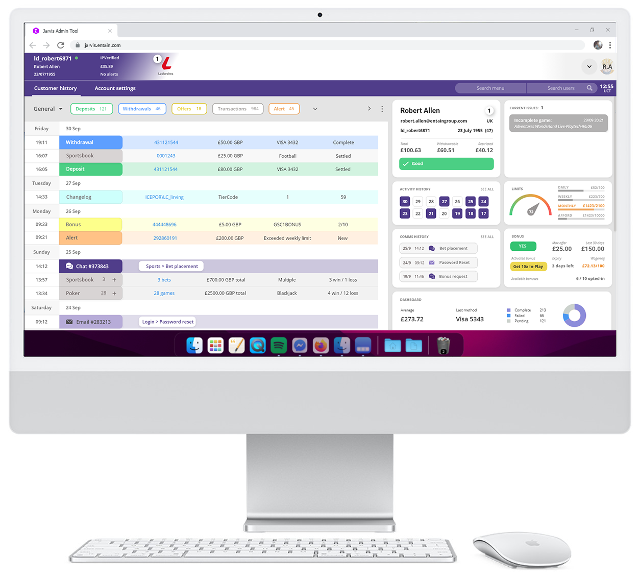
Combining the data of thousands of customers of a large conglomerate, into a single, in-house system. As an independent UX consultant, the stakeholders invited me to audit and improve an existing two-year project to better suit its intended role. Running retro workshops revealed concerns and successes of the current project and I devised a plan to bring user-centred design to a tech-lead project.
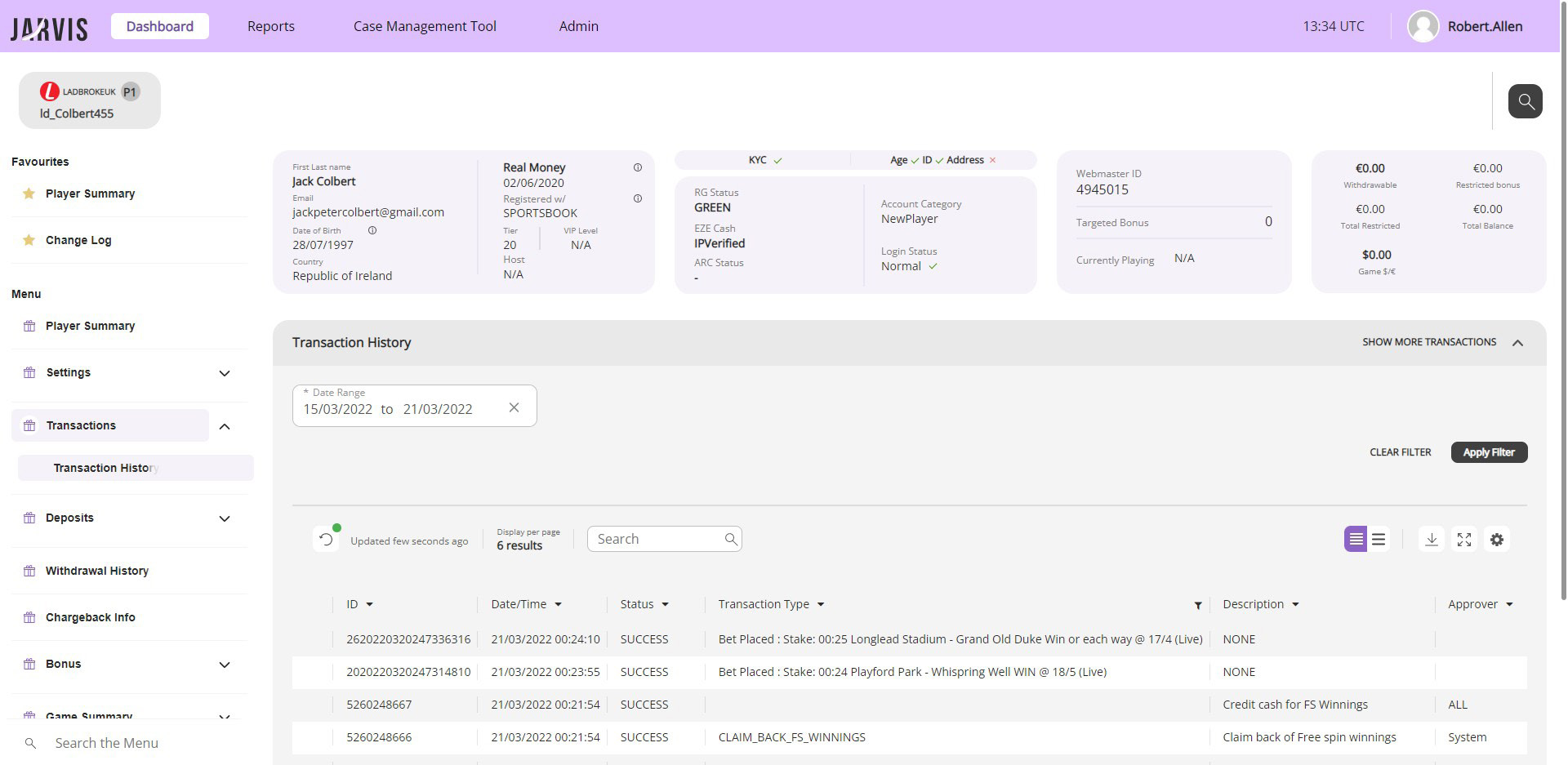
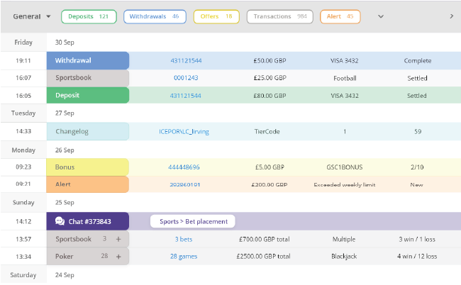
Jarvis current system
02.
Observing agents
It was eye-opening to see just how stressful the agents' job was. They were required to deal with a vast amount of data whilst chatting to multiple gamers simultaneously. I wanted to reduce stress with efficient functionality. Observing the agents in real-life as well as interviewing them, allowed me to gain deep insight into their behaviour and task flow.
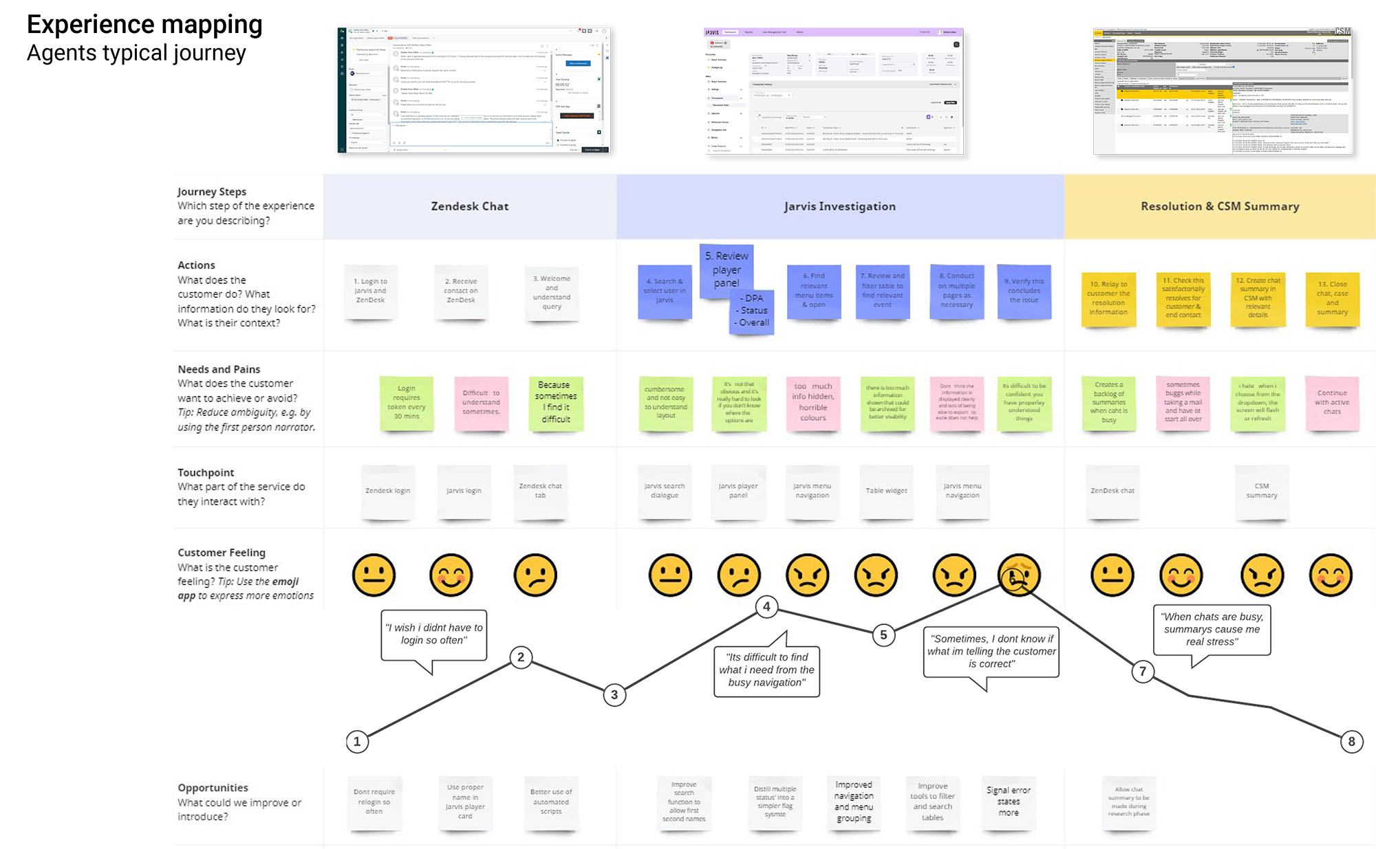
Agents operate in a pressured, intense environment, handling multiple cases simultaneously, often with agitated customers
03.
Auditing the current system
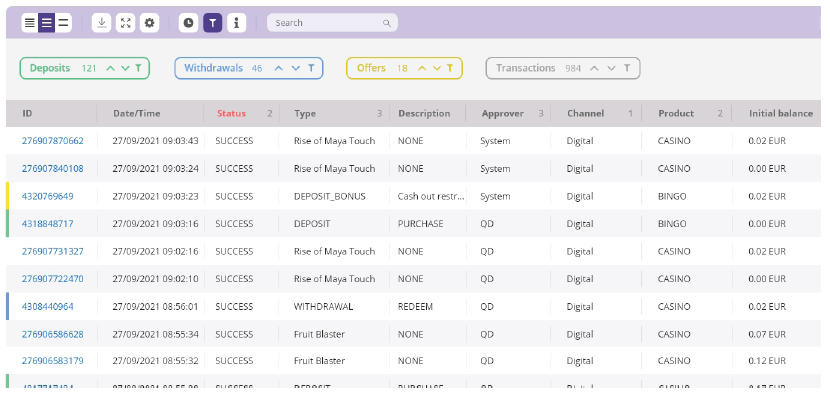
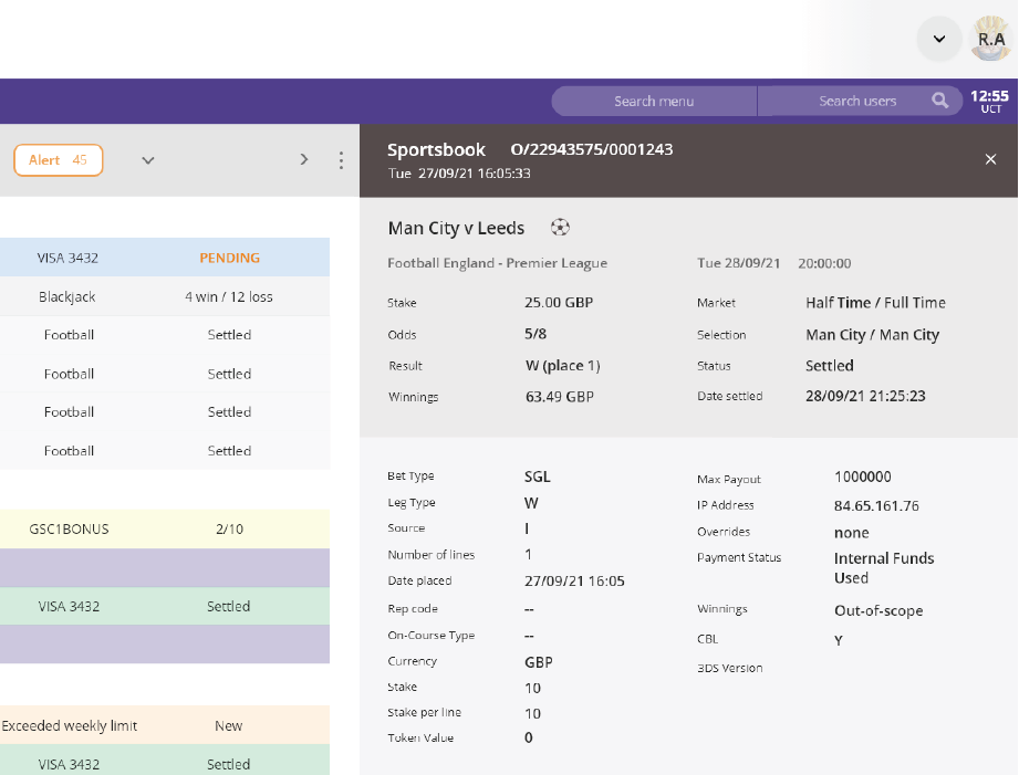
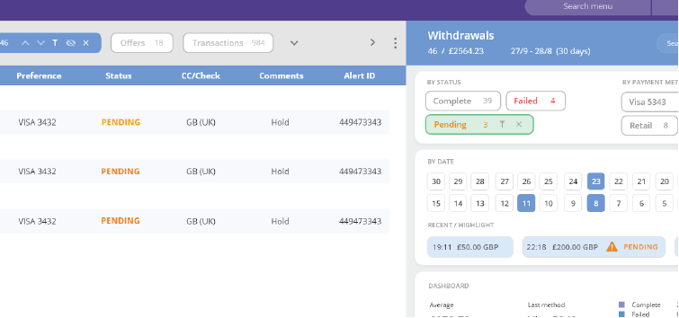
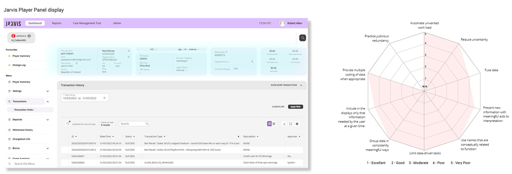
Auditing the existing Jarvis system exposed areas for improvement. Agents were required to navigate between complicated, unformatted tables across multiple pages. Storing this information separately conceals potential causal relationships, and the lack of hierarchy and formatting makes it difficult to discern what's meaningful amongst the noise.
Heuristic analysis
Conducting a hueristic analysis allowed me to quantify performance issues related to layout, structure, widgets, menus and information clarity. It was clear that automating calculations and reducing the agents' cognitive workload would allow for improved customer service.
Metrics analysis
Analysing customer contact metrics highlighted the top 10 queries the agents dealt with.
04.
Focus areas
My research exposed the clunky information architecture and illogical naming causing agents to struggle to navigate through the correct information.
The design system and colour differentiation made it problematic to find important information whilst mass amounts of customer data meant agents were unable to find what they needed when they needed it. I decided to make this more seamless as well as including branding.
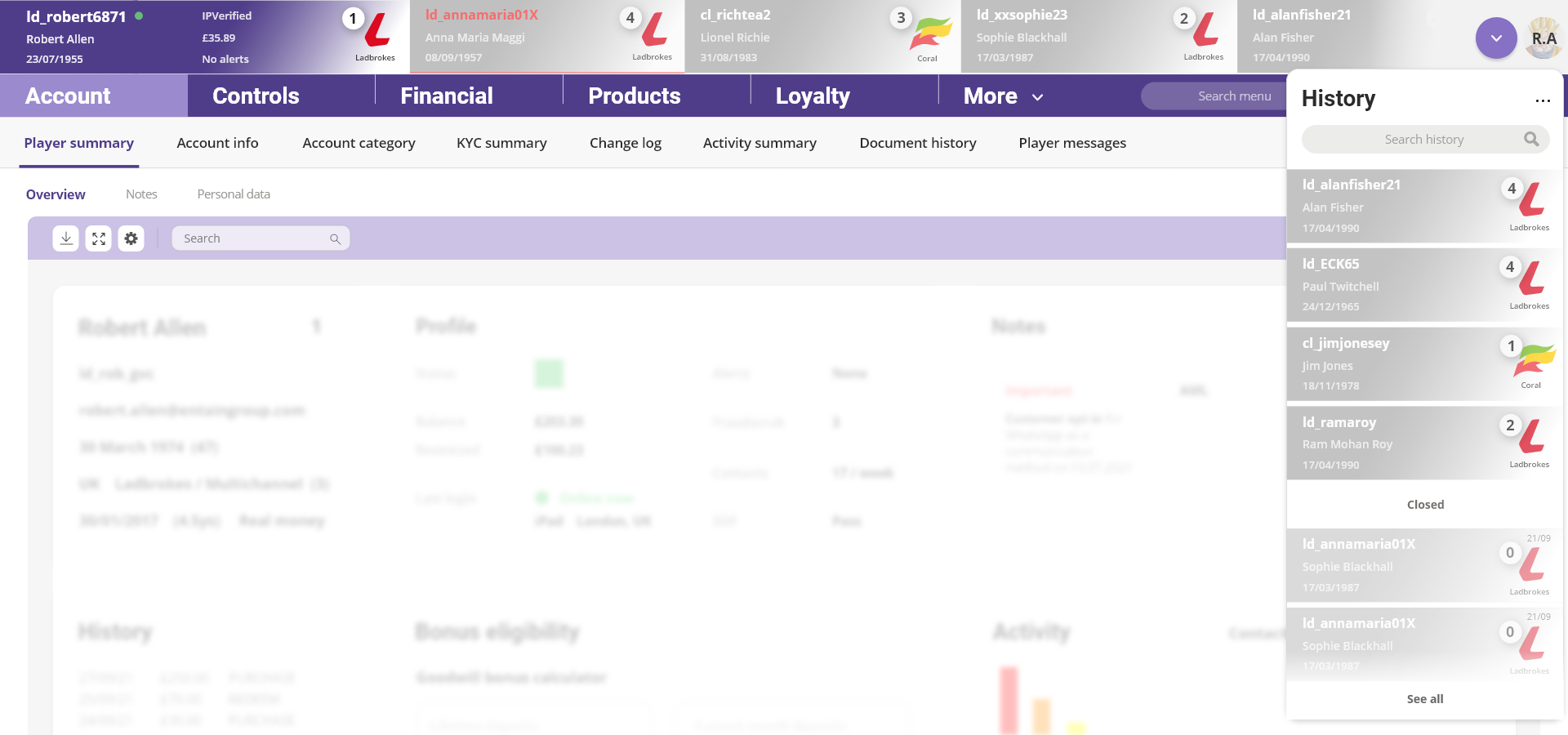
Poor differentiation between active and inactive players made it difficult to differentiate which player was which during multiple chats. I needed to enable agents to view all of the gamers' information and know exactly which data applied to which user.
70% of queries followed the same user path for the agent but agents were having to repeat the process instead of the software doing it for them.
An inefficient note-making process came at the end of the case, instead of throughout, which created a backlog causing errors and poor quality.
Can we improve the accessibility of important information and increase efficiency for agents with some relatively minor adaptations to the layout?
05.
Principals for a better experience
For the redesign, I created seven guiding principals to enable agents to act efficiently:

06.
A new vision - A visiontype to move the needle
Menu navigation
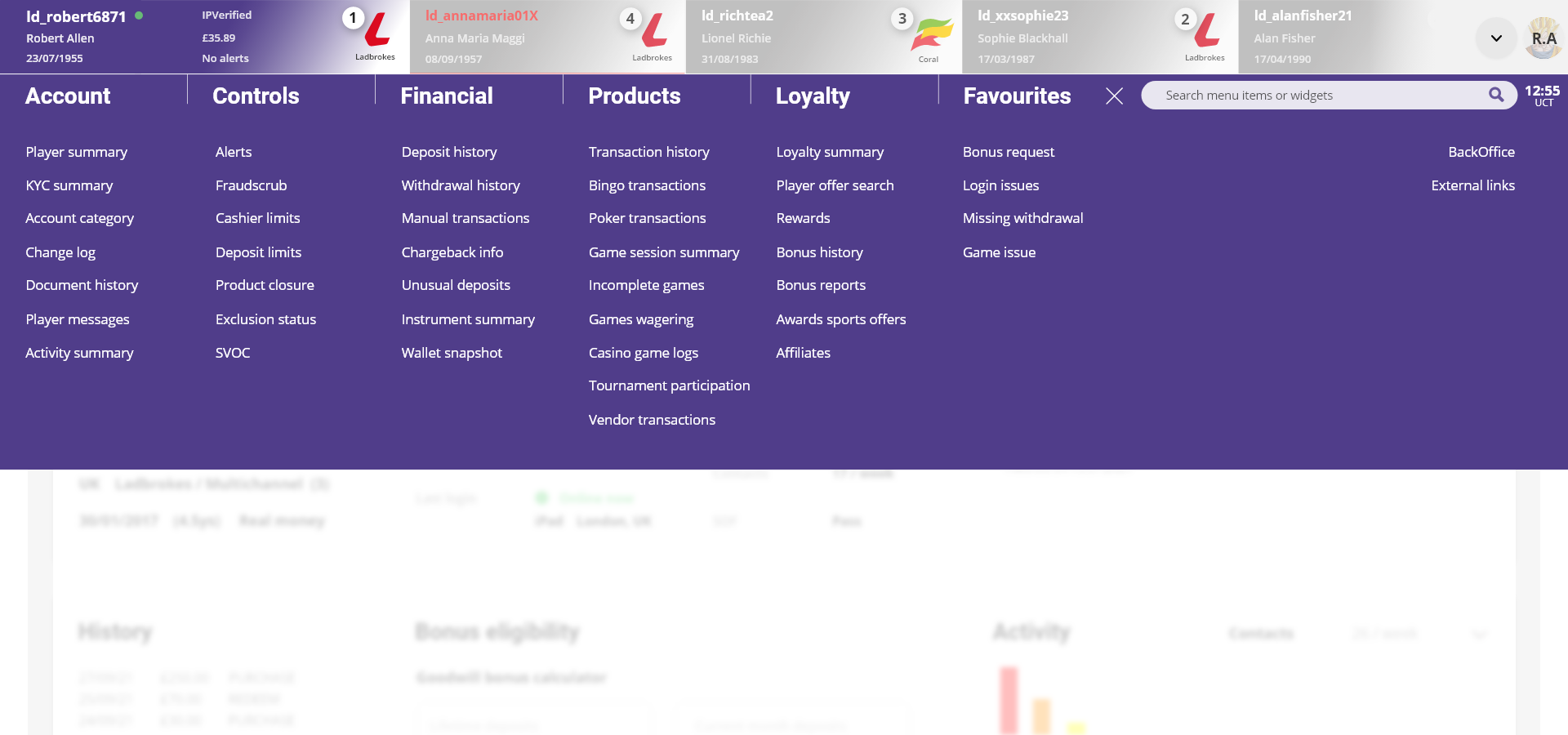
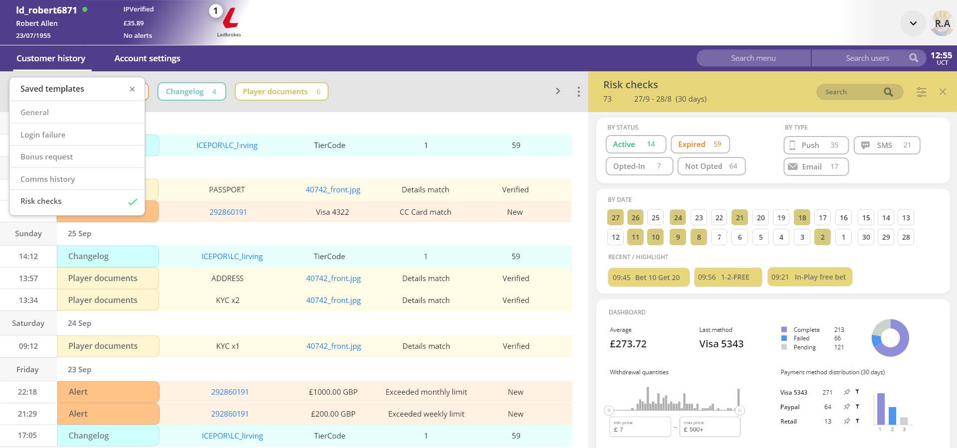
From the results of card sorting, I prototyped a navigation to test the new information architecture. Prominently anchored at the top of the page, the 60 menu items are accessible through 5 tier 1 categories: Account, Controls, Financial, Products, Loyalty.
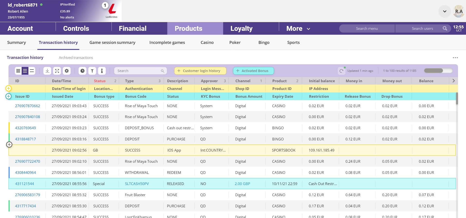
Each category revealed its own page with an overview of the information held in easily navigable categories.
